Paul Krugman, ki mu pripisujejo termin “brezmadežna dezinflacija“, v zadnjem komentarju na dolgo razlaga teorijo dezinflacije (prek koncepta Phillipsove krivulje) in zakaj je ta v mainstream makroekonomiji običajno zelo boleča (“costly”, ker prek recesije uničuje delovna mesta). Nakar razpravlja, zakaj tokrat nismo doživeli stagflacije kot v 1970-ih. Zanimivo pa je, da je na koncu (morda zato, ker se mu je mudilo končati komentar) pozabil na glavni razlog, zakaj tokrat nismo doživeli stagflacije in imamo opravka z “brezmadežno dezinfacijo”. Razlog je po mojem zelo preprost: ker je bila ta inflacija povzročena s ponudbenim (in ne povpraševalnim) šokom (zaradi post-covidnih zamaškov v ponudbenih verigah in porasta cen energentov in hrane) in je torej po svoji naravi prehodne narave. Takoj ko so se ti dejavniki izpeli, je inflacija začela upadati (in v ZDA konsistentno upada že od julija lani).
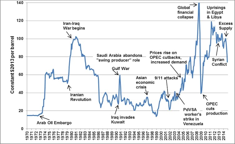
Vseeno pa je za neekonomiste Krugmanova poljudna razlaga zelo poučna in preprosta (tudi tistih nekaj enačb je zelo popreproščenih). Vendar pa Phillipsova krivulja ni najbolj primeren koncept za razlago opcij dezinflacijskih politik v primeru porasta inflacije zaradi kratkoročnih ponudbenih šokov, saj se v tako kratkem času inflacijska pričakovanja niti ne morejo oblikovati. V 1970-ih smo imeli drugačno situacijo zaradi dveh naftnih šokov in trajnega učinka na raven cen zaradi trajno povišanih cen nafte (glejte sliko spodaj).
I always considered extreme pessimism about disinflation to be sensationalist scaremongering; the current extreme optimism, on the other hand, makes me a bit nervous. So I thought some readers might be interested to read a potted history of the relevant economic doctrine with some actual data attached.
…
OK, then. In the beginning was the Phillips curve, a purported downward-sloping relationship between unemployment and inflation. Such a relationship isn’t hard to justify. When the economy is running hot, you would expect to see rising prices: Firms believe they can get away with charging more, workers believe they can demand higher wages, and with wages and prices rising, producers will see their costs going up and raise prices further. A hot economy also tends to have a low unemployment rate, so some correlation between unemployment and inflation makes sense.
In 1958, the New Zealand-born economist A.W. Phillips found such a correlation between unemployment and wage growth in Britain, and the idea of an unemployment-inflation trade-off was adopted by many economists. (The 2 percent inflation target also has its origins in New Zealand. Are Kiwis the root of all economic evil?)
In the late 1960s, however, Milton Friedman and Edmund S. Phelps argued persuasively that inflation also depends on expectations of future inflation. The experience of the 1970s seemed to bear that out, and it became standard for economists to write down an “augmented” Phillips curve looking something like this:
Inflation = -b × (u-u*) + expected inflation
Where u* is what Friedman called the “natural” rate of unemployment, the rate at which actual inflation equals expected inflation, u is actual unemployment, and b is the rate at which wages and prices adjust to markets.
Now, only a silly economist (of which there are a few) writes down an equation like that in the belief that it represents truth. It’s more a matter of trying to keep yourself honest, representing your ideas with explicit algebra for the sake of clarity — and also making it easier to prove yourself wrong.
Still, let’s run with it for a while. Obviously, it matters what determines expected inflation. In the 1970s it seemed reasonable to assume that firms and workers based their expectations of inflation on the recent past. If you assume that expected future inflation is just last year’s inflation, the Phillips curve becomes:
Inflation = -b × (u-u*) + last year’s inflation
Which you can rearrange to get:
Change in inflation = -b × (u-u*)
And for a while this last equation actually seemed to work, sort of. The Congressional Budget Office produces an estimate of u*, which it calls the noncyclical rate of unemployment. And if you plot the difference between actual and noncyclical unemployment against the change in core inflation (excluding volatile food and energy prices), it looks like this from the ’60s through the mid-80s:
Image
Ye bad old Phillips curve: It’s all about changes in changes.Credit…Bureau of Labor Statistics, Congressional Budget Office
Physics it isn’t. But as you can see, high unemployment did seem to be associated with falling inflation, low unemployment with rising inflation.
Unfortunately for economists, although fortunately for the economy, that apparent relationship vanished in the 1990s. What we seemed to see instead was the re-emergence of the old simple correlation between unemployment and the level of inflation:
What happened? The conventional wisdom is that after a long period without episodes of major inflation, people stopped updating their inflation expectations based on the recent past. Surveys suggest that expected inflation didn’t just drop in the 1980s, it also became anchored, no longer changing much even when there were brief inflation spikes:
Then came the pandemic and the policy response to it. Suddenly inflation soared to levels not seen since the early 1980s. This shouldn’t have happened according to the standard Phillips curve, but there was a lot of weird stuff going on.
Indeed, things have been weird enough that it’s not at all clear what measure of inflation we should be using. For what it’s worth, here’s old-fashioned core inflation — using three-month changes rather than annual rates in an attempt to smooth out some of the statistical noise while keeping up with a rapidly changing situation:
What went up came down, fast.Credit…Bureau of Labor Statistics
But everyone working with the data these days knows that traditional core has become problematic in the plague years. The numbers have been buffeted by new sources of volatility, such as used car prices; the official measure of shelter prices, which mostly reflect rents but with a long lag, has been distorted by a huge rent surge in 2021-22 that ended months ago but is still filtering into the published numbers; and new problems keep emerging. For example, the White House Council of Economic Advisers, while producing some new, reassuring wage numbers, also cautions us that the Consumer Price Index has recently been understating health insurance costs.
So a lot of effort has been going into estimating how many angels can dance on the head of a pin — I mean, “true” underlying inflation. It’s a worthwhile, even important exercise. But the bigger picture is the speed with which inflation, however one imperfectly defines it, first soared, then plunged.
When inflation surged, several influential economists argued that we were back to the bad old days represented in my first chart, in which the harsh logic of the Phillips curve meant that reducing inflation would require years of high unemployment. I could say that I found the emergence of such views puzzling, because nothing in the available evidence pointed to a return to traditional stagflation, and the strangeness of our times had clearly complicated the traditional thinking on inflation.
But the truth is that I wasn’t just puzzled, I was angry — it seemed to me that declarations that the ’70s were back were sensationalist and irresponsible fearmongering.
As you might guess, I have views about what actually happened. But this newsletter has already gotten too long.
For now, my point is that we obviously aren’t rerunning the ’70s. While I’m cautious, on the other hand, about fully embracing the doctrine of immaculate disinflation, inflation does seem to be coming down as quickly and easily as it went up, and without too much economic pain.